“With gorgeous worktops from us, and inspired colour schemes from your very own personal taste, we know for certain that you will be able to create the most magnificent U-shape kitchen of all time!”
A U-shape design is perfect to use available space that your kitchen has, and they also create lots of work surface area. So if you are not sure on what layout to create in your kitchen, and you have lots of wasted space then a U-shape design is the perfect one!
A U-shape kitchen design is a design that frees up floor space and has features such as cabinets and appliances of three walls. It is sometimes called a C-shape with an open end for access.
The U-shape layout was developed based on decades of extensive research. It particularly works in any size kitchen, but is most effective in a large space. The shape is useful and versatile, and is down to the home owner’s personal preference.
A U-shape maximises the wall space and makes it easy for chefs to access various areas of the kitchen without having to walk across the room. You certainly can work very efficient in a U-shape kitchen style.
The cleaning zone is generally on the external- facing wall, which sits in the lower curve or bottom of the “U”. The oven is typically placed down one side of the leg of the “U”, with lots of cabinets, drawers, and usefull storage space. Opposite that leg of the “U”, on the other leg of the “U” typically is the fridge and other storage spaces.
U-shape kitchens naturally create a boundary between the kitchen and other areas of the room. This type of layout is perfect for an open plan living space.
Pros of a U-shape
A U-shape kitchen has seperate work zones for food prep, cooking, cleaning and a dining area. One main factor of a U-shape design that it is very safe. The design does not allow through traffic, so means only one person at a time, no spills, and makes the cooking less chaotic.
The only down fall is that sometimes a U-shape can be more expensive, because more cabinetry and worktops are required for the additional run of units.
Planning
Your planning of a U-shape kitchen should start off with where your windows are located. If one of the walls has a window, then this would usually be perfect for the kitchen sink. The window will give you the natural light you are after when completing tasks. You can also gaze out and think of the beautiful beaches you wish you were laying on instead of doing the dishes. It obviously does depend on the view you have though.
Position the sink on the middle run and the hob down one of the other runs. I think this is the best bet when designing a U-shape layout. If the two runs vary in length, then the longer wall would usually house the hob allowing adequate space either side. Having said that the sink placed on one of the runs works just as well.
Have a U-shape layout offers the opportunity for symmetry within the design of it.
Work Space
A well designed U-shape layout will ensure only a limited number of steps required between the different appliances and units. So when cooking you only need to take a few steps to the sink to wash your hands. This is a perfect safety factor during cooking, and when guests are present. It is a clean and uncluttered look and provides lots of storage space, generous worktop space, and everything is in easy reach. Even with a small U-shaped kitchen such as a 2620mm x 2040mm with a 700mm gap between the opposing runs, can still be generous for cupboards and space. So please don’t worry if you have only a small kitchen, because you can still create the perfect U-shape kitchen.
Corner Storage
A great advantage to a U-shape layout is having corner storage, such as a carousel or a Le Mans corner unit. They make use of the space, and without the corner options, you would loose this space, and use areas in the kitchen that would be extremely difficult to access, like the back of your cupboards. They fit in perfectly in the bends and create space like you have never seen before!
Peninsula Perfect
Sometimes with a small U-shape kitchen it can be harder to insert a peninsula, but sometimes it is possible to arrange the U-shape so that one of the legs extends in to open space. They could become perfect for a seating area to make the space more sociable, or to house a sink or hob. They can be great for adding extra work top space and storage space.
Island
Certainly if you have the room in your U-shape layout, then inserting an island in the middle is a bright idea. As a rule of thumb you will need to make sure that if you do plan an island in to your U-shape, then there will have to be a 1m walkway on all sides. An island is perfect for adding additional worktop space as well as storage solutions and perfect party seating.
Curves
Everyone loves a curve! Curved corners are for creating a flare of stylish design. They look great, and I love them! They are left to flow around the kitchen, to really add a soft feel. However, unfortunately they can reduce storage space. If you have a large kitchen then this may not affect you.
Our Customer’s U-shape designs with our fabulous Worktops
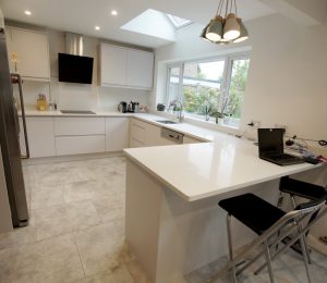 This kitchen is in fact from Wickes! It just goes to show how expensive the kitchen can look, especially with our premium worktop Bianco Stella. The perfect peninsula has been added on the end to divide the open plan space. Additional seating has been applied to the outer side, for work use, and for a dinner party. You can see that the sink has been located by the window, perfect to watch the wildlife in the garden and dream about them perfect beaches. The white crisp colour scheme certainly gives the kitchen a breath of fresh air. The worktops, windowsill, splash backs and upstands have all been made out of our stunning Bianco Stella.
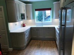 The worktops and windowsill featured in this kitchen are made from our Bianco Marmo Suprema. The kitchen features curves, and straight lines, making a quality and luxurious kitchen. The taupe colour cabinets blend in certainly well with the white subtle marble effect worktop. Again the sink has been located by the window for a perfect view when completing tasks.
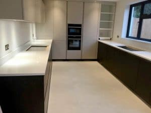 Another customer here has used our Bianco Marmo Suprema. Must be popular! This has been created in to a stunningly beautiful U-shape kitchen using our premium white marbled effect quartz. Even a tabletop was also designed for this particular customer, showing off our skills of being able to achieve a 45 degree angle on all the sides with a 50mm thickness. Again the customer has opted for their sink to be by the window. Well who wouldn’t? A great modern kitchen with the right colour scheme in mind.
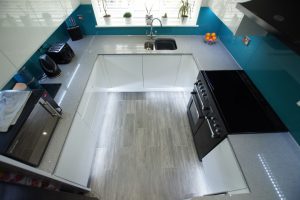 A Wren kitchen is featured here with our Grigio Medio Stella Quartz. Our customer has opted for our grey quartz with mirror pieces throughout to compliment the turquoise splashbacks and the white gloss doors. Yet again the sink situated by the window! A mini peninsula has been added on the end that features the perfect wine cooler. Cool or what?
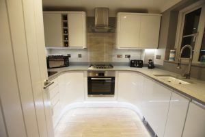 Another Wren kitchen with our Grigio Medio Stella. Now this has become popular with U-shapes and Wren kitchens! It certainly does go well with the shape, white gloss on the doors, and stainless steel appliances. A real handsome kitchen! Curvy and straight lines are designed in to this kitchen. It really does show you what our team can do!
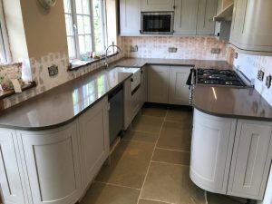 Our Mocha has been used in this lovely U-shape kitchen. The colous perfectly match the colour of the cabinetry aswell as the floor tiles. I think this customer is a real coffee lover! They will wash the dishes and think about coffee! As you can see they will not have to walk far from the sink to the cooker.
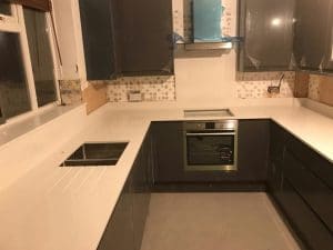 Our Bianco Nevoso is fitted in to this perfect U-shape kitchen. This beautiful white/grey quartz only came out last year, and has a very subtle marble effect throughout. With the dark gloss of the cabinets, it certainly looks a million dollars next to the white coloured quartz.
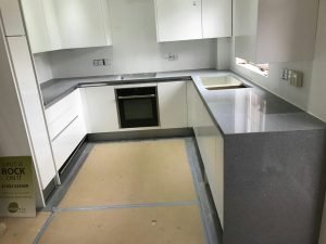 This U-shape kitchen offers oodles of style. With our Grigio Scuro Stella, which is a dark grey with mirrored pieces throughout, stands amazingly out next to the high gloss white cabinetry. The curved hob cut-out has been made possible from our CNC technology.
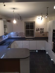 The Grigio Scuro Stella is proving to be a big hit at Rock & Co. It is a dark quartz with mirrored flecks throughout, and is very unique to our quartz range. The perfect peninsula has been added on to the end for additional seating for when the guests come. It features curves and straight lines, showing off the customer’s true personality with their creativity.
I hope that some of our customer’s projects have put you in the right direction to create the most perfect U-shape kitchen ever imagined! We would love to hear from you, to make your worktops the best they will ever be, to fit in with your U-shape style!
