“Grey kitchens are proving a major hit”
With the new release of “50 Shades Freed” set to enter out screens this Feb 18, it would be a fitting tribute to look into how the power of grey has when designed into a kitchen.
Grey can be used in a kitchen to create a soft appeal and a fresh take on traditional designs, and it can also be used to create bold and fashionable modern designs. Grey is an ideal starting point to create new and exciting ideas into your home. Whether you mix it with traditional wooden features to add warmth or add pops of colour to cool it down, it will work and transform your kitchen into a timeless piece that everyone will envy. Cool greys look brilliant with stainless steel, and brightly coloured accents, and bar stools and splashbacks will help lift the mood. You could even be different and go for a grey quartz worktops instead of a white or black.
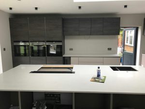
Do you remember the lime greens and oranges that were a major hit in the kitchen in the 1970s? The grey palette is something totally different to this and is becoming increasingly popular in today’s homes. It is all about the tone, layering up the different accents of grey and combining it with other accents to create a masterpiece. An all-white kitchen will look great with grey accents, just like the main photo of this blog. It is a sleek and sultry industrial style kitchen that oozes with style and fills the area with grace.
When choosing an accent of colour or a mixed palette, you can’t go wrong with the colour theory. Either select contemporary colours, which are next to each other on the colour wheel, or contrasting shades from opposite sides of the wheel. An island set in a deeper or contrasting colour than the walls or the other cabinetry will create a focal point in the kitchen. For a stronger contrast, light and dark greys will work perfectly, or two bold greys of the same weight and balance. Too much of a heavy colour will make the room feel smaller (not ideal for small kitchens), so you do need to think about the balance the colours will have.
Contrast greys…
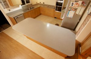
Use a grey for the worktops to contrast with a traditional oak kitchen that will make an impact and style statement just like the picture below. Our customer has used the Nebbia Grigia style quartz in a 30mm thickness. It is a grey version of the Bianco Marmo Suprema. The stainless steel appliances blend in seamlessly in this kitchen design and match the worktops.
Layer greys…
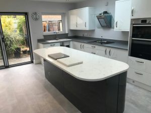
Create a cohesive look in the kitchen using various shades of grey to pick out individual elements of the room. If you have a breakfast bar or an island you could make a statement with this using a darker grey just like in the picture below. Our customer has used a combination of Carrera & Grigio Scuro Stella style quartz. The Carrera style quartz has been used on the main focus of the kitchen (the island) with a dark grey cabinetry. The Grigio Scuro Stella quartz has been used on the main run of the units with a high white gloss cabinetry, a combination that works very well.
Sophisticated…
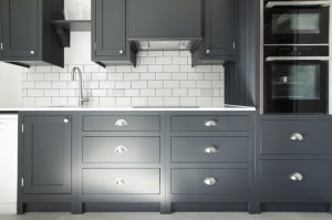
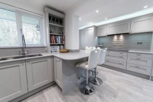
This high end country style kitchen lends itself to the soft shades of grey used. Combining the light shades of grey from the floor, to the cabinetry, to the tiles, the Grigio Chiaro Pura style quartz fits in perfectly. The bar stools help lift the mood with their sleek design. It is a sophisticated kitchen for all the family and a light airy hub of the home with all the space you need.
Sleek, sexy and streamlined…
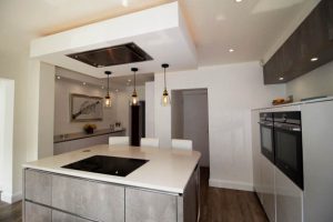
A complete streamlined and sleek modern grey kitchen this is. The light grey on the island and the darker grey on the ceiling cabinets contrast the white worktops and glossy cabinets beautifully. The worktops are the Bianco De Lusso. The dark wooden floor brings depth to the space and the three pendants suspended above give elegance and class.
Bold…
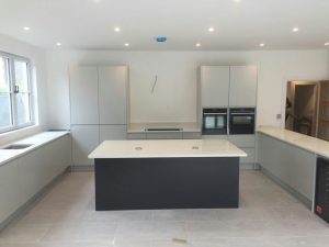
Making a bold statement in a grey kitchen is to colour block. For example in the picture below our customer has chosen to create their island the main focal point in their hub of the home opting for a dark, bold grey completed with the Bianco Minerale style quartz. The light, bright white surrounding the island of the cabinetry and worktops opens up the space very well, and is very satisfying. To even add a bit more pattern to your design, you could try a bit of geometric fun, keeping within the grey theme! Add copper accessories for a touch of warmth or keep within a monochrome look.
Make a statement with Mr Grey…
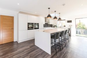
This is a fine example of making a statement with Mr Grey, as the accents in this kitchen have been used of a grey palette making way for an industrial kitchen that oozes style. A white high gloss kitchen sits in this home that has a streamlined and minimalistic approach. A very large island sits in the middle on grey washed wooden floors with sleek and sultry grey leather bar stools neatly lined up in a row. Grey pendants hang three in a line above the work area lighting up the space, and dark glossy grey brick like tiles are used as a splashback behind the cooking area.

