“Learn from your mistakes”
When designing a kitchen sometimes we often make mistakes and don’t realise. If we don’t learn from our mistakes, we normally repeat them without knowing. In this blog I will talk about some of the known decor mistakes that are made in a kitchen space and how we can avoid them.
Not enough sockets….
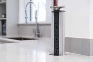
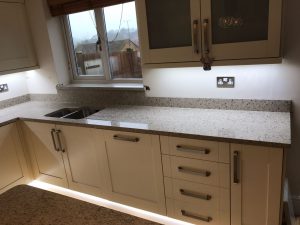
A kitchen has alot of electrical gadgets within, so making sure there are enough sockets to go around is key. Plan your sockets correctly so you don’t have to unplug the mixer for the toaster. Like in this kitchen a worktop socket that pops out of your worktops! Brilliant idea.
Too many open cupboards…
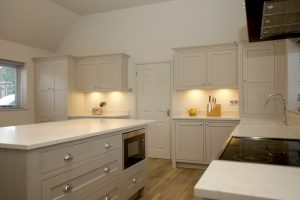
Cupboards that are open can show off too much of your clutter, and your hoard of kitchen appliances. Opt for cupboards with doors so they can be hiden away for a minimalist style. The kitchen belows has so much storage and cupboards with doors you will be able to hide anything behind!
Not the adequate ventilation…
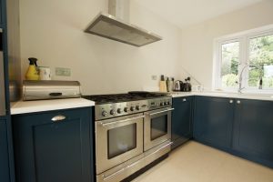
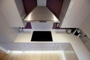
A hub of the home is where the cooking begins and hot air and scents flow. You need to make sure you have implemented as many doors and windows as you can with the best extractor fan around the hob. In the kitchen below the perfect cooker hood has been chosen for their space.
Overdone with stainless steel…
Too much stainless steel can look quite intimidating in a kitchen space and especially if the hub of the home is small. Too much shine will diminish the kitchens character and warmth. Wood, glass, concrete, tiles and quartz will break up the shine and add depth. A white glossy kitchen sits beneath with a beautiful tile splashback and wooden floor.
Inadequate lighting…
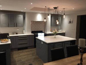
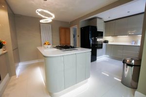
You need the best lighting possible in your hub of the home. Task lighting is key when preparing the dinner. Layered lighting is a great idea to make sure every surface is covered with light to make it clearly visible. The adequate lighting has been put in place in this kitchen for task, accent and ambient.
Knobs and handles that are awkward…
Inconvenient knobs and handles can make it harder to open cupboard doors and drawers. You want to be able to grasp the handle easily to open it up, afterall you are going to be opening them numerous times. Rather large handles have been put on this cabinetry that makes it easier to open up the cupboards and drawers.
Colour clash…
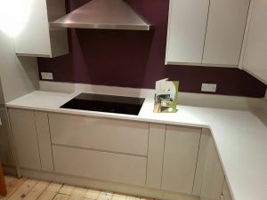
There is nothing worse than choosing the wrong colours together, it will make the room feel cramped and untidy. You need to make sure you take time on choosing the best colours to tie in with your decor. Create mood boards and colour boards to see the colours together before you get the paint brush out and paint it onto the wall. This purple, aubergine colours goes perfectly with the white glossy cabinetry in the kitchen below.
Get rid of the dustbin…
Make the dustbin become invisible by hiding it behind a closed cabinet or door, or even in the laundry room just like the kitchen below. Nobody wants to see your trash and what it consists of, and is there really any pretty waste bins around that you can match into your kitchen decor?
Making the kitchen impractical…
You need to make sure the kitchen is as cosy and as multi-functional as it can be. So be prepared for social events and add cushions to your bar stools or chairs. Beautiful mongolian seat covers have been placed on these bar stools around the rather large island in this kitchen.
Getting the size wrong…
It is quite often we choose a piece of furniture we love, but when it comes to placing it in the room it doesn’t fit. Measure correctly first and you will be onto a winner and the perfect piece of furniture that you will enjoy for many years to come. A stunning wooden dining table has been placed in this open-plan space that’s perfect for entertaining.
