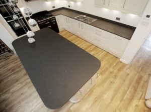
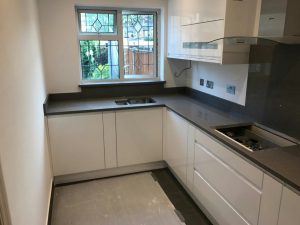
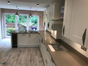
“Design an L-shape kitchen for more worktop space”
To make the most out of your kitchen how about deciding on an L-shape. They are practical, concise and look great! If you are a budding chef and you want everything at hand an L-shape style will give you just that and make it a joy to use.
When you start to decide on the layout for your kitchen your choices are dictated to you by the size and shape of your hub of the home, but that doesn’t mean you have to be restricted on the design. Whether you have a small, medium or large kitchen, an L-shape layout works with both contemporary and traditional cabinetry. The L-shape design is very practical, and a perfect multi-functional style.
The definition of an L-shape layout…
An L-shape design is where two adjoining walls meet in the corner forming an “L” that’s connected with worktops. It allows for more floor space than a U-shape layout and is very popular in today’s designing of kitchens. In a larger room you could have only one surface run along a wall and the other to protrude into the living space, and if you have an open-plan space, it creates a divider between the kitchen and the living/dining space.
Make the most out of a smaller kitchen…
An L-shape layout in a smaller kitchen is ideal as it allows storage and appliances to be on two sides of the room and the other sides of the room free and open, to make the overall space seem bigger and a great space to socialise. Paint in light colours to open up the space. It also allows to entertain better. You could even transform it into a eat-in kitchen-diner, where table and chairs can be placed on one side of the room to allow for hosting guests and using it as extra worktop space.
Add a kitchen island…
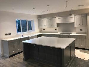
If your space allows to fit in a kitchen island, then add this to an L-shape layout for a place to eat, extra worktop space, storage and a great focal point for the centre of the room. Pull up bar stools are perfect as they are space saving and can tuck easily underneath the island. You could also use it for a cooking area to cook up a storm in front of your guests.
You need to think of storage in your L-shape…
The L-shape layout needs to be functional as well as stylish. Storage is very important when it comes to designing the ultimate kitchen. Cabinets from floor to ceiling are ideal for an L-shape giving you extra room and opt for a storage carousel, to make the most of every cupboard. The “working triangle” is another factor to be considered where the appliances like the sink, oven and fridge will be positioned into the kitchen area. They need to be installed in a comfortable distance apart for convenience. If you are thinking of putting the cabinets floor to ceiling you will need to consider adequate lighting in the kitchen, so you don’t have to deal with dark spots.
It will give the illusion of more space…
An L-shape layout offers more floor space, making it easier to move around and offering an illusion of a bigger room. Store away as much as possible so the worktops don’t look cluttered. You don’t want to hide away those beautiful, stunning quartz worktops. Spread the sunlight across the kitchen with lightly coloured walls, and you don’t want to block any sunlight out with cabinets.
Some more of our customers L-shape kitchens…
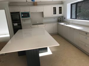 Our customer here has chosen to finish off their hub of the home with the stunning Bianco De Lusso. It’s a beautiful colour choice to go with the chosen coloured cabinetry that is laid out in an L-shape, and especially a perfect match with the dark coloured island centred in the middle for the ideal focal point.
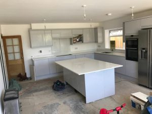 Our customer here has chosen the gorgeous Bianco Stella in their hub of the home. It is a perfect L-shape layout giving enough room in the centre for the ultimate island. An all white kitchen, with a hint of sparkle shining through from the worktops.
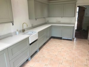 Our customer here has chosen to finish off their hub of the home with the amazing Bianco Carrina. It is a white style quartz with a subtle marble throughout. It certainly is the perfect choice to go with this sage green L-shape layout.

