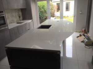
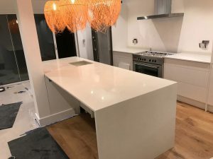
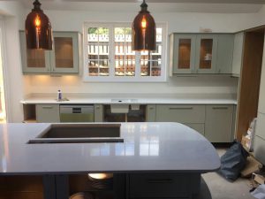
“Design a ship like layout known as the galley kitchen”
The galley style kitchen is the most efficient kitchen of them all when it comes to cooking. A galley kitchen features units on either side and a corridor down the middle. It could be an opening room to another room or could be closed off with a wall at one end. These types of kitchen make space of small, cramped spaces. Many restaurants and commercial kitchens feature this layout too. With a galley kitchen you can still create the “working triangle” into the layout with your appliances, so that the fridge, cooker and sink are easy to flit to one another. It is very popular in large open-plan spaces and especially where you can provide a long island as the second leg for a casual seating area.
Alot has changed in the way we design our kitchens nowadays. This type of layout works very well in most kitchens and the smallest of spaces. The galley layout is named after the galley on ships, where it optimizes space by packing in an abundance of storage and work area.
In this blog I will be talking about however big or small the space is, a galley kitchen will fit and also how to style it into your hub of the home.
Look at your space…
A galley style kitchen works very well in a small space, though they can also be great for a medium-sized kitchen. You don’t want the opposing runs too far apart as the kitchen will loose it’s efficiency.
Working the appliance triangle into a galley layout…
In a galley kitchen you want to create an ideal layout for your appliances, where you can access them easily and still be organised. The idea of the “kitchen triangle” is to connect the hob, sink and fridge together. It is very important to ensure your appliances are arranged in a manner that is stress-free and to stop you from doing more work than you have to. It’s a great idea to keep your hob and sink on the same side of the kitchen to avoid having to go back and forth.
Planning the cabinets and shelves in the galley layout…
This is important as you don’t want to overcrowd the space. The rule is you need to have plenty of room to move around and to store all of your essentials. You don’t have to necessarily have to mirror each side of they layout perfectly, but making them both similar will help you to achieve a balanced outlook and consistent finish. For extra storage you could place tall cabinets on one wall and leave the workspace on the other side open. Overhead storage can also give you more space and not break up the rest of the kitchen. Display your special china on that open shelf placed in the middle of the room.
Do you prefer a symmetrical or asymmetrical galley kitchen…
Symmetrical– A symmetrical galley style kitchen means the length of the runs and the arrangement are practically the both on each side, as much as you want or as much as possible.
Asymmetrical– An asymmetrical galley style kitchen uses various approaches and breaks up the run. It means where one wall involves having taller cabinets or a bank of appliances, and base to wall units on the other. Or go for a mix on either side.

Design your galley layout into an open-plan space…
Open-plan spaces are very popular in today’s homes. Lots of people want to be able to join in the conversation from the cooking area to the entertaining area. The basic design of two parrallel runs of units in a galley style remain popular which includes a kitchen island, and is seen as a room divider. There is lots of space for food prep, and eating at the breakfast bar, to formal dining beyond.
How to add lighting in a galley layout…
You need to make sure you have the most adequate lighting in the hub of the home, afterall it is a working area all times. You want the kitchen to feel bigger also, so simple tricks that lighting can do will make it into a comfortable and stylish space.
Make sure there is plenty of natural light coming in if you can. Do not block windows or overcrowd them with cabinets, and shelves will allow the light to filter through the room more fluidly.
Layer the lighting to add additional strenghts of lighting and illumination throughout the room. Scatter lamps and shelf-lights throughout the room.
If you have a feature you want to emphasise task lighting is ideal for this and especially to light up those fabulous worktops for working on. Add under-shelf spotlights or a pendant.
Streamline it…
A run of glossy units work beautifully in a galley style kitchen, as it creates the optical illusion of more space. It is very sleek and modern and will make your hub of the home the best it’s ever been. A handleless kitchen keeps the area minimal and smart. You want them special worktops shining through so don’t clutter them up, and integrated appliances are perfect!
Style and colour…
You want to choose a colour that opens up the space. Light coloured cabinets will instantly create a bright atmosphere in the hub of the home and welcome all who enters. Our quartz worktops especially will be great to create a personal and sophisticated finish, we have many colours to choose from. You could also create a layered look of colour across the room using different tones of one colour. Dark colours allow the light to bounce across the room, that will create an impression of a larger room. Dark units with lighter worktops will work great and not overwhelm a smaller space. Hanging a mirror is a unique and glamorous addition to any kitchen. It will tie your theme in from one side to the other and I just love the sound of that!
Some of our customers galley kitchens…
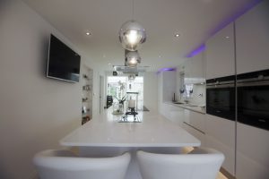 This is a stunning white glossy, handleless kitchen that features a galley style layout with an impressive island centred in the middle. The kitchen is finished off with the perfect worktops which are the Bianco Marmo Suprema. A run of appliances are on the right with plenty of worktop space next to it and on the opposite is an open-shelving feature that showcases all their best china. The customer has gone for an asymmetric galley layout that is open one end flowing into a living space and we love it!
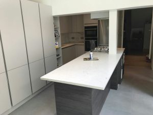 This modern, sleek glossy white, handleless galley style kitchen features the spectacular Carrera style quartz. One end of they layout is open and the other end is finished with a stainless steel double oven and fridge freezer. An island is positioned in the middle of this layout that seperates the living area to the kitchen area, creating the perfect open-plan space. There is lots of storage space and most importantly worktop space. Open-shelving is designed into this kitchen showing off personal items and special china.

